I have to say one of my favorite things about living in Indiana is seeing the seasons change.

Especially, during the fall. The brilliant colors which paint the landscape are magical. I tend to decorate with an eclectic flair but stay true to a rich color pallet. To me, finding what speaks to you is what decorating is all about. I know the white, gray and neutral hues are on trend, don't get me wrong I do think they are beautiful, but I find that I gravitate toward the rich, dark tones when I decorate. Again, it is what speaks to you. Find out what that is and try not to be afraid of it (movie quote: Never Been Kissed)
Which brings me to one of my favorite places in the house to decorate...my entryway. It is that place where greetings and hugs are shared with family and friends OR where first impressions are made. As I mentioned above, with this design I have stayed true to the rich colors of fall. Dark, burnt orange and mustard yellow with a splash of classy black and gold.
Let the fun begin....start with a blank canvas...

Who says a wreath is only for your front door? I added a wreath to hang over the mirror. It brings a dramatic element to my design.

Laying down a strip of fabric, table runner or place mat (OR a combination of these items) builds the foundation you can use to anchor your design.

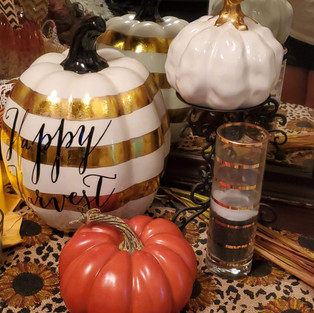
I started with a large gold, striped, ceramic pumpkin to add a focal point to my design. It adds a cheerful greeting and a bit of glam...I mean really, who doesn't love a bit of glam? I especially love this big guy because I can use it over the course of the fall season. When I decorate for Halloween, I simply turn it around so you don't see the greeting. Then turn it back again for Thanksgiving. Really getting my money's worth!

Next, I wanted to balance out the left side. I used a large basket with a linen place mat embellished with a crocheted edge tucked inside. Add in a tall, skinny, ceramic pumpkin and a smaller basket with a few flowers and things are beginning to come together.

When I decorate my house, I have two things I normally incorporate. The letter "R" for my last name OR a rooster. Sometimes, I do both. This time I placed a black and white rooster and a few other simple items like candles to finish out the left side. When you keep the same colors flowing throughout your design it brings a cohesive look to your space. In this design, I also tried to keep a balance of the colors when I placed them. Being sure not to have too many of one color in an area makes your eye travel around the space.

I could stop here and leave it A-symmetrical.....but I wanted more :-) I added in a few more pumpkins to fill in the right side. When you use multiple items which are the same but different, you create another dimension of interest. Again, working with my color pallet, I have pulled all the colors to the right side and created movement to the design. You will notice that I even placed one of the pumpkins on a candle holder. Don't be afraid to think outside the box. If an idea pops into your head, try it! Step back and take a look....you might just like how it works with your design.

In the end, I felt like the space had a flow of color and multiple items of interest. Just know, I didn't place something and immediately like it. I had to play around with the design. What helps me, is to gather up all the pieces I want to use and begin with the largest item or what brings the most impact to the design.
Let your imagination flow....Express Your Creativity!


Comentários